Raw numbers: just showing the data
It is essential to keep in mind that you don’t always need to use a chart to display your data. Sometimes, just showing the data as text is the most effective way of conveying information.

Single value KPI card: When you have a number, it’s best to report it as-is. Plotting a single value graphically (such as with a bar or point) usually isn’t meaningful if there aren’t other values to compare.
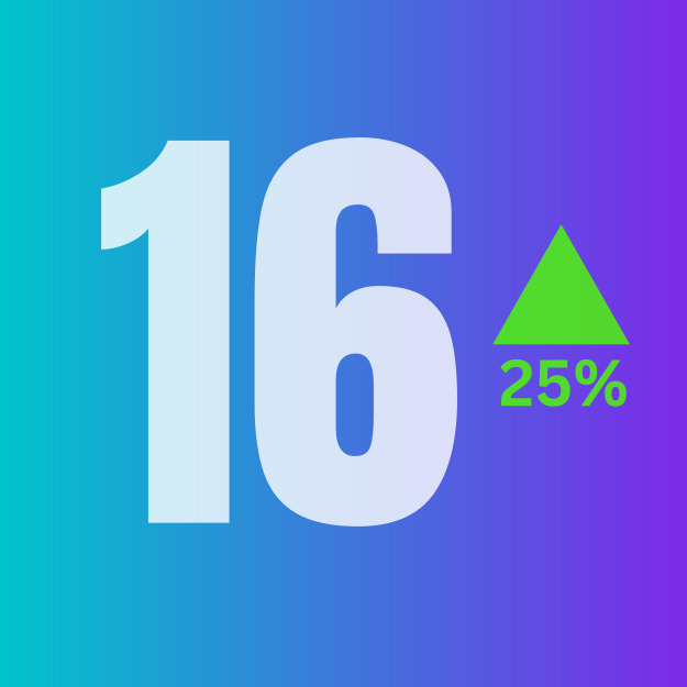
Single value with indicator: An indicator compares the single value to a second number. A KPI card compares a metric’s value between the current growth and the previous period.

Bullet Chart: Chart type comparing a single value to another number, often a benchmark rather than another data point. The single value is shown with a bar’s length, while comparison points are displayed as shaded regions or perpendicular lines.
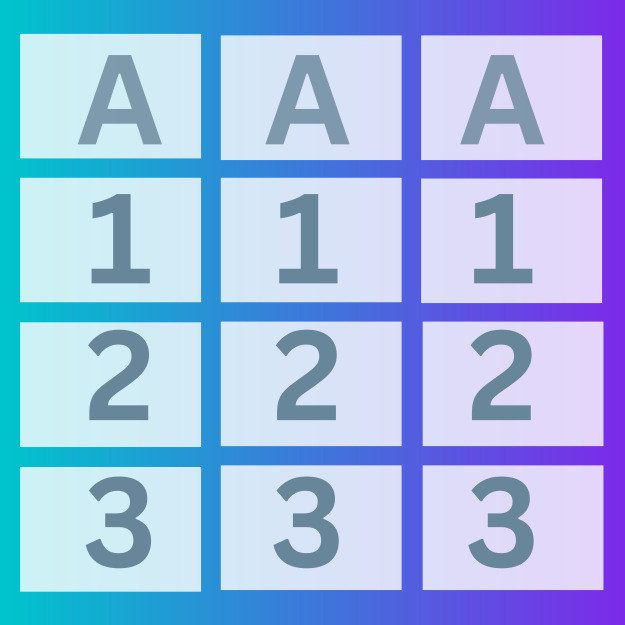
Table: Compares data points (rows) across multiple attributes (columns). A critical or prominent fact usually sorts them to improve utility.
Charts for showing change over time
One of the most common applications for visualizing data is to see the change in numeric value for a feature or metric across time. These charts usually have time on the horizontal axis, moving from left to right, with the variable of interest’s values on the vertical axis.
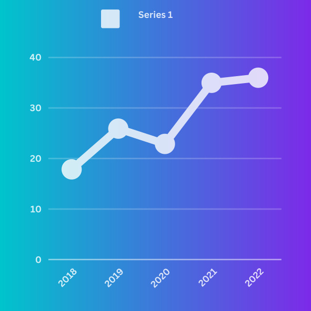
Line chart: Most common chart type for showing change over time. A point is plotted for each time period from left to right; each point’s vertical position indicates the feature’s value. Points are connected by line segments to emphasize progression across time.

Sparkline: A miniature line chart with little to no labeling, designed to be placed alongside text or on tables. Provides a high-level overview without attracting too much attention. Can also be seen in a spark bar form, or miniature bar chart (see below).

Connected scatter plot: Shows change over time across two numeric variables (see scatter plot in Relationships). Line segments still connect points across time, but they may not consistently go from left to right like in a line chart.
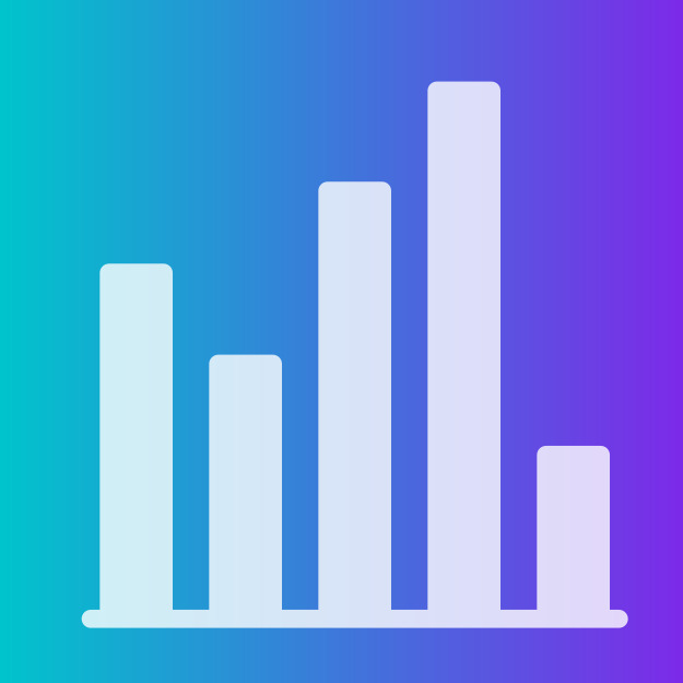
Bar chart: Each time period is associated with a bar; each bar’s value is represented in its height above (or below) a zero baseline. Works best when there aren’t too many time periods to show.
Charts for showing a part-to-whole composition
Sometimes, we need to know not just a total, but the components that comprise that total. While other charts like a standard bar chart can be used to compare the values of the components, the following charts put the part-to-whole decomposition at the forefront.
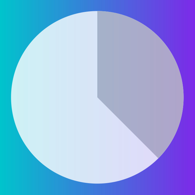
Pie chart: The whole is represented by a filled circle. Parts are proportional slices from that circle, one for each categorical group. Best with five or fewer slices with distinct proportions.

Doughnut chart: A pie chart with a hole in the center. This central area can be used to show a relevant single numeric value. Sometimes used as an aesthetic alternative to a standard progress bar (see stacked bar chart below).

Waffle chart/grid plot: Squares are laid out in a (typically) 10 x 10 grid; each square represents one percent of the whole. Squares are colored based on categorical group size.

Stacked area chart: A line chart (see Change over time) where shaded regions are added under the line to divide the total into sub-group values.

Stream graph: A Modified version of the stacked area chart where areas are stacked around a central axis. Highlights relative changes instead of exact values.

Waterfall chart: Augments a change over time with a part-to-whole decomposition. Bars on the ends depict values at two-time points and lengths of intermediate floating bars show the decomposition of the change between points.
Mosaic plot / Marimekko chart: Can be thought of as a stacked bar divided on both axes. A box is divided on one axis based on one categorical variable, then each sub-box is divided on the other axis based on a second categorical variable.

Tree map: Can be thought of as a more generalized Marimekko plot. Sub-boxes do not need to have a consistent cut direction at a particular hierarchy level, and there can be more than two levels of hierarchy.
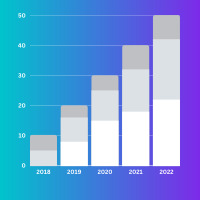
Stacked bar chart: A bar chart (see Change over time or Distributions) where each bar has been divided into multiple sub-bars to show a part-to-whole breakdown. A single stacked bar can be used as an alternative to the pie or doughnut chart; people tend to make more precise judgments of length over area or angle.
Charts for looking at how data is distributed
One important use for visualizations is to show how data points’ values are distributed. This is particularly useful during the exploration process when trying to build an understanding of the properties of data features.
Note: Charts for visualizing data distributions across two or more variables are covered in the Relationships chapter.

Bar chart: Used when a variable is qualitative or takes discrete values. The height of each bar indicates the amount of each categorical group.
Histogram: Similar to a bar chart, but used when a variable takes continuous numeric values. The variable’s numeric range is divided into bins for aggregating counts. Bars are plotted flush against each other to emphasize the variable’s continuous nature.

Box plot: A box and whiskers show the range of the most common data values. The ends of the box outline the central 50% of the data. More often used to compare distributions between groups rather than as an overall summary.
Charts for comparing values between groups
A very common application for data visualization is to compare values between distinct groups. This is frequently combined with other roles for data visualization, like showing change over time or looking at how data is distributed. As a result, this is the largest category of chart types.

Bar chart: Most basic way of comparing numeric values between groups or categories. Each group is assigned a bar; each bar’s value is represented in its height above (or below) a zero baseline.
Grouped bar chart: Extends a bar chart to compare data across two categorical variables. Each bar corresponds to an intersection of variable levels: categories for one variable are indicated by the bar cluster positions, while the second variable is indicated by bar color or position within each cluster.

Line chart: Each line in a line chart shows how values (vertical position) change across time (horizontal). One line is plotted for each group to be compared. Best when there are five or fewer groups to plot.

Bump chart: Modified version of a line chart where vertical position corresponds to rank rather than value. This change allows it to support more categories than a standard line chart.

Grouped bar chart: Normally, grouped bar charts will plot the bars within each group in a consistent order. However, they can instead be sorted by value within each group to emphasize ranking, at the cost of making it more difficult to find each sub-category.
Charts for observing relationships between variables
One task that shows up in data exploration is understanding the relationship between data features. The chart types below can be used to plot two or more variables against each other to observe trends and patterns between them.
Scatter plot: Standard chart type for showing relationships between two numeric variables. Each point’s position on the horizontal and vertical axes indicate value on the associated variable

Bubble chart: Scatter plot with point size dictated by a third numeric variable. Scatter plots can be extended in other ways: point shapes can encode a categorical variable, and color can be used to indicate either categorical or numeric data. It is best to keep a scatter plot to a maximum of three variables to maintain understandability.
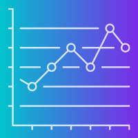
Connected scatter plot: When a third variable represents time, points in a scatter plot can be connected with line segments to show progression in values across time.
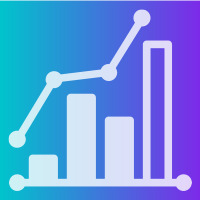
Dual-axis bar-line plot: A bar-line plot shares a horizontal axis (typically time) across two chart types: the bar chart and the line chart. Useful or when the variables plotted with each chart type are related but are on different numeric scales.

Grouped bar chart: Extension of bar chart (see Comparisons or Distributions) to two categorical variables. Bar clusters are associated with levels of one variable, while color or position in each cluster indicates levels of the second variable. The length of each bar at the corresponding intersection of levels indicates a value for that group, like data frequency or a summary of a third numeric variable.

Heatmap: Extension of bar charts and histograms (see Distributions) to two variables, each of which can be categorical or numeric. Each axis represents groups or bins of values for one of the variables, forming a grid. Cell colors indicate data frequency or a summary of a third variable for each intersection of axis variables.
Charts for looking at geographical data
Sometimes, data includes geographical information like latitude and longitude or regions like country or state. While plotting this data might simply extend an existing visualization onto a map background (such as those in the previous chapter for depicting relationships), there are some chart types that specifically take the mapping domain into account.

Bubble map: Bubble chart built on top of a geographic map, where point size is an indicator of value. Can also be used to group together points in a scatter map if they are too dense.

Scatter map: Scatter plot built on top of a geographical map, using geographic coordinates as point positions.
